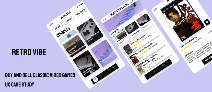
Retro Vibe
Role:UI/UX, Visual Design, Researcher
Duration: 9 Weeks
Tools Used: Figma. WebAim, Google Gallery, Zeplin, Miro, Lookout
Overview
This User Experience project is called Retro VIbe, a ecommerce video game based app that allows customers to buy, sell and trade classic video games with each other and retailers (pawn shops, online stores, etc) on different platforms that aren't easily found in stores anymore. I created this as part of my user experience course at Udacity. I designed, created tests, and from start to finish using research, analysis, UX and UI design principles, test validation, usability, and feedback from participants.
Context
Retro Vibe is a ecommerce videogame app that I developed for my user experience nanodegree from Udacity. The goal of this project was to learn the fundamentals of user experience and to apply app design research, conduct in-depth interviews, prototyping, and data analysis to create a UX case study.
Research Plan
Research started with deciding on what gaming platform to focus on to simplify the process. I chose the Playstation 2 because it was the best selling video game console ever and had a wide variety of games that are great and people still play, and it had most of my favorite games also. Then I looked at some ecommerce apps that sold a variety of different items (technology, clothes, etc) to get an idea of what the design of the app should look like.
Screening QuestionsThen To get a better idea of what else should be on the app I created some screening questions to ask some of my friends and family that played video games what types of games/systems they wanted to see on the app to increase their chances of using it. (link to PDF of screening questions)
Script sent to ParticipantsAfter the screening questions I also created some research questions for the participants to gauge their video game habits today as adults compared to years ago when we played games regularly. ( link to PDF of Usability guide)
Research ReportFor the research report after the initial screening questions were made and sent to the participants; we soon found out that the data we gathered were vague and more data was needed (questions were more about the participants' past and present habits). More research on the subject of collectors habits and preference behaviors were needed to accurately create an app that would be beneficial to the users. I looked at some research papers and youtube videos on the subject and found that collectors focus more on rarity, condition, and popularity of the item in the market. For the initial sketch I still used the e-commerce references I found to sketch out the first design.
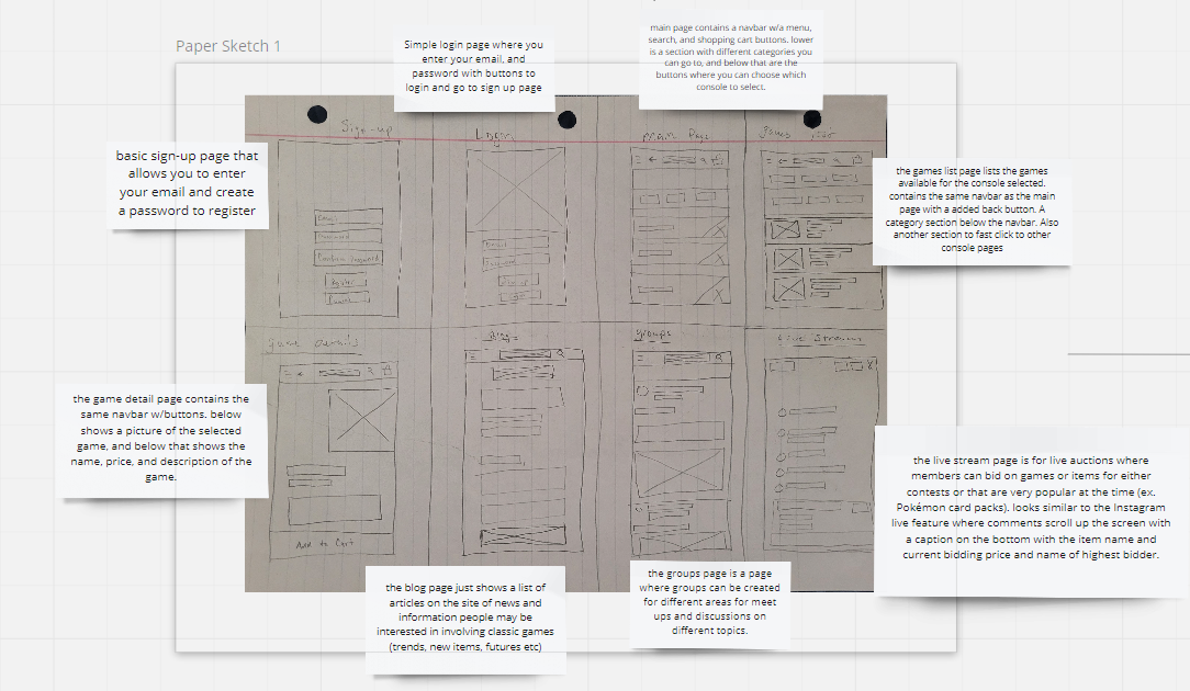
Crazy 8 Design Sprint
For the initial sketch I still used the e-commerce references I found to sketch out the first design since it was just structure and no specific information was needed yet.
Research Synthesis
Click for Full Miro Board
-Explain Results for each board
-Interview notes and Synthesis: after analyzing the results gatherers from the participants, the data was grouped into 4 categories
digital copies of games are popular than physical
sell games online but not frequently
have never sold any items online
doesn't collect classic games at all
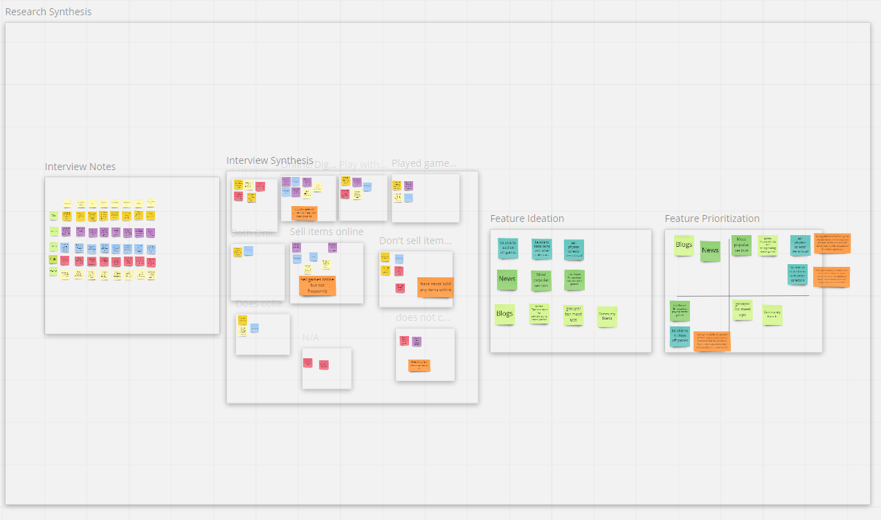
feature Ideation
For feature Ideation I came up with new ideas to possibly add to the app in the future. Then for Feature Prioritization I created a chart and picked 3 ideas that would make the app better that was not too difficult to build onto the app. Those ideas were: being able to sell other game related items online: because this would expand the use of the site and will drive more traffic because of the wider audience. having the ability to trade items with other collectors: because this gives customers another option to obtain items easier and rare items that are hard to find Having the ability to auction off items: because this gives customers a chance to bid live on items from other customers fast and possibly at a lower price.
usability study/design iteration
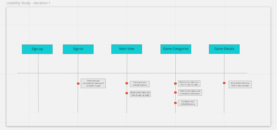
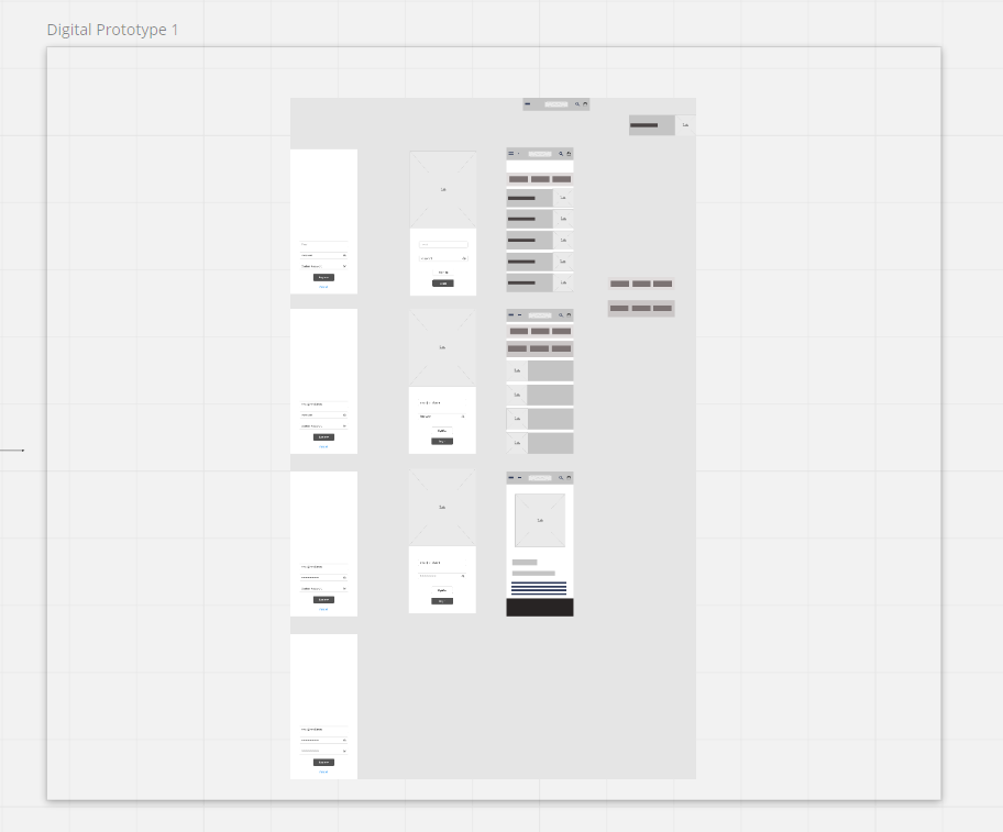
The first prototype using Figma which included a sign-up/sign-in page, main page, Item page, and item detail page. I found a few participants to test the prototype out and the results surprised me. I found that out of the 5 people who tested it all seemed to have trouble and got confused with the sign-in/sign-up screens, but the rest of the app functioned great. That was a good indicator to remove those pages for now since it could be easily added in later and focus on the main pages where the content mattered. Other minor changes made were naming the pages and making sure the back button worked correctly on each page.
After the low-fi and mid-fi prototypes were tested the only changes made were the categories section. The high-fi redesigns had the most changes after the third round of testing. participants said the app looked good but had a few suggestions for accessibility reasons and customer shopping needs.
Accessibility
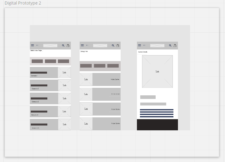
The accessibility changes that were made to the app were adding a favorites button on the details page, color scheme change to the entire app, and adding a additional lower nav bar for buttons on the first 2 screens. Also added the categories section back to the main screen and redesigned the buttons on that page also.
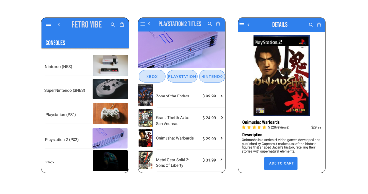
Final Product
My final solution for the app ended up being to add more details/options on the details screen and have the same button styles across all screens. overall i did learn a lot while working on this project. the biggest lesson was that even if I was familiar with the industry I was building the app for, I should have done more extensive research on the subject to better accommodate the companies needs and to streamline the design process all together. I still do plan on designing the additional 3 pages of the app and believe that with those pages it would create a better experience for the customers visiting the app.
